First Impressions
The first spray of Water Calligraphy feels like watching a single droplet disturb a still pond—precise, deliberate, and unexpectedly beautiful. There's an immediate brightness, a citrus-tinged sparkle that mingles with something cooler, more aqueous. Water lily announces itself not with heavy-handed florals but with a whisper of green wetness, as if you've caught the scent of stems just lifted from a ceramic vase. The grapefruit doesn't shout; it glimmers alongside, adding a prismatic quality that keeps the opening from settling into simple prettiness. This is By Kilian in a contemplative mood, trading the house's usual opulence for something closer to minimalist elegance.
The Scent Profile
The architecture of Water Calligraphy reveals itself in layers, though "layers" feels too heavy a word for something this translucent. The top notes—water lily and grapefruit—create what can only be described as luminous negative space. The grapefruit provides more bitter rind than juice, a sophisticated astringency that prevents the water lily from becoming too decorative. Together, they establish a canvas of coolness, a backdrop of damp air and light.
As the composition opens, magnolia and jasmine emerge in the heart with remarkable restraint. This isn't the indolic, almost narcotic jasmine of classic orientals, nor is it magnolia's typical creamy richness. Instead, both flowers seem filtered through water, their essential character preserved but their volume turned down to a murmur. The magnolia brings a lemony cleanness, while the jasmine adds just enough skin-like warmth to remind you this is a perfume, not an impression of a Zen garden. The floral accord dominates completely—the data shows it at full intensity—yet it never feels overwhelming.
The base is where Water Calligraphy makes its most interesting statement. Vetiver and cardamom create an unexpected foundation beneath all that delicate florality. The vetiver is green rather than smoky, maintaining the aquatic character established at the opening while providing necessary structure. Cardamom adds a whisper of spice, an aromatic quality that reads more as texture than flavor. These base notes don't announce themselves loudly, but they're what keep the fragrance from evaporating into pure ephemera.
Character & Occasion
The community has spoken clearly on this point: Water Calligraphy belongs to warm weather and daylight hours. Spring claims 87% of seasonal votes, with summer close behind at 82%. This makes perfect sense. The fragrance captures that specific quality of spring mornings—the coolness that still lingers in the air, the promise of warmth to come, the first flowers opening without the heavy sweetness of full summer.
As a daytime scent, it scores perfectly—100% day appropriate. The 18% night rating tells you everything you need to know about its character: this isn't a fragrance for mystery or seduction. It's for clarity, for presence without announcement. Think morning meetings, gallery openings, long lunches that stretch into afternoon. It's the olfactory equivalent of crisp linen or a precisely tied silk scarf.
The feminine classification feels accurate but not restrictive. Anyone drawn to transparent florals and fresh compositions will find something to appreciate here. It suits those moments when you want to smell intentional but unobtrusive, elegant but approachable.
Community Verdict
With a 3.74 rating from 501 voters, Water Calligraphy sits in that interesting middle territory—well-liked but not universally beloved. This score suggests a fragrance that does exactly what it intends to do, appealing strongly to those seeking its particular aesthetic while perhaps leaving others wanting more drama or longevity. It's worth noting that polarization often comes with minimalism; some noses crave the subtlety, while others find it underwhelming.
The solid vote count indicates a fragrance that's found its audience despite not being By Kilian's most famous offering. These are people actively seeking out something specific, and many of them found it here.
How It Compares
Positioned among fragrances like Hermès's Un Jardin Sur Le Nil and Byredo's La Tulipe, Water Calligraphy occupies the space of sophisticated aquatic florals. Where Un Jardin Sur Le Nil leans more directly into green tomato leaf and lotus, Water Calligraphy stays cooler and more traditionally floral. La Tulipe shares a similar transparency but focuses its attention more narrowly on one flower.
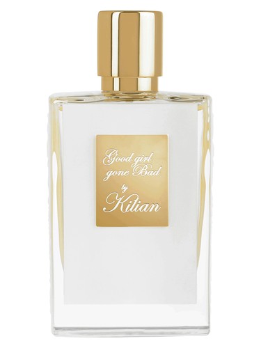
Interestingly, it also neighbors two By Kilian stablemates: Good Girl Gone Bad and Bamboo Harmony. This suggests the house has carved out a territory in fresh, floralcy that differs significantly from their heavier offerings. The Coco Mademoiselle comparison hints at the jasmine connection, though Water Calligraphy is far more aquatic and less ambery.
The Bottom Line
Water Calligraphy succeeds at being exactly what its name promises: an exercise in artistic restraint, where beauty emerges from minimal gestures rather than baroque elaboration. The 3.74 rating reflects a fragrance that won't be everyone's masterpiece but will be deeply appreciated by those who understand what it's attempting.
Should you try it? If you're drawn to fresh florals that prioritize elegance over projection, if you want something for warm weather that feels refined rather than fruity or beachy, if you appreciate perfumery that whispers rather than shouts—absolutely. It's a fragrance for people who understand that sometimes the most memorable statement is the one made quietly. Just know that you're investing in artistry and refinement rather than compliment-generating presence or marathon longevity.
AI-generated editorial review